Thursday, February 28, 2008

Letterpress Step 3: Making a photopolymer plate out of your illustration

So here we are at the third installment of the process of getting from illustration to letterpress product. In the first installment we made a simple two-color illustration on the computer using a favorite photograph. In the second step of the process we prepped that file for printing. At the end of the second step, with the consideration of the unique requirements your personal printer or plate-maker might have, you were ready to send your file off to have a plate made for you. In the case that you are sending your files off to be made into a plate, this information will be purely for your curiosity about what's going on behind closed doors at plate-makers' shops. (If you'd like more information about the process vis-a-vis working with professional plate-makers, check out Boxcar Press.

If you are interested in using a photopolymer plate making lab which may be available in some printmaking departments or studios, this information will be valuable to you. While I describe the process that I use to make the plates, I'll inject a few interesting resources I've found on the web that document inexpensive ways to set up a plate-making operation in your own home, although I have no experience doing it in that fashion.


Step 1: At the end of the last installment we had separated the two colors but had left them in their appropriate Pantone colors. In this step we need to convert each colored portion into plain black. Remember that grays or halftones do not work well in this process, so make sure everything is either black or white.


Step 2: Resize the images to be the same size as they will appear on your final letterpress product. If you'd like to use the same image in multiple sizes, you'll need to make multiple printouts and multiple plates. I've combined both images onto one 8.5"x11" page and printed a single copy. If you are interested in drawing something by hand with traditional pen & ink you can skip to this step in the process and use that illustration to make a negative directly.


Step 3: A negative needs to be made from your printout. Using a film negative service will produce a superior negative, but if you're doing it low budget or doing it at home, a transparency from a copy machine will work just fine. Load the transparencies into the copy machine and select "Negative/Positive" (may differ from machine to machine) and create a negative of your printout. Since transparencies are not quite as opaque as film negatives it's a good idea to make two copies, line them up exactly, and tape them together (being careful not to cover any of your art).


Step 4: This step needs to be done in a darkroom environment because the plates are light sensitive. If you decide to set up shop at home, you can purchase virgin plates from Boxcar Press in various sizes & widths. If necessary, cut a plate to fit the size of your negative – it can be smaller but make sure all your art is on top of the plate. All the photopolymer plates I've worked with have a side with a protective cover on it. Peel that off when you're ready and flip your negative face down on top of the freshly peeled side. Looking at it, your art should now be backwards.


Step 5: In order to "burn" your image onto the plate, you need to expose the plate to light. Thankfully I have access to a lab with a big expensive machine that has a vacuum action to pull the negative tightly against the plate and expose the plate to the light needed. With any machine or even in your own home if you don't have resources with recommended exposure times, you may have to do a little experimentation to get it just right. Exposure times can also differ depending on the weight of your lines or the intricacy of your design, I've found.

There's a DIY tutorial for making photopolymer plates in your own home by Maggie Bergman that I've found at Silver Clay Art. She details some of the above steps as well, but most importantly talks about how to clamp a negative to the plate using clips, expose using fluorescent or halogen lights, and how to make test strips. All very important things if you're interested in doing this at home.


Step 6: (This step should be done in a darkroom environment.) If you have a plate-washing machine you can use that (I do about 6 minutes this way), but if not use a soft brush and water to rub away the part of the plate that was not touched by light coming through your negative (aka the white space in your original). The plate will feel slimy (and be kind of smelly) during this process. You want to continue lightly scrubbing until the details of your design start to feel sharp-edged under your fingers. If there are little bumps in the middle of white space areas or the plate still feels really slimy, you need to scrub a little more. Don't scrub too vigorously or too long – you may end up with no design at all! Maggie Bergman recommends 2-3 minutes of scrubbing to get it cleaned out when doing it by hand. When you're all done you'll see what will be the colored part of your design raised in the plastic.


Step 7: (This step does not need to be done in the dark.) Before you use your plate it's important to firm it up. I use a little plate oven that's at about 80 degrees Celsius for 5-6 minutes, but Maggie Bergman recommends using a blow dryer or fan heater at home. I've seen someone somewhere talking about nail polish hardening machines, too. :-) You don't need to completely dry out the plate – it should still be flexible when you're done and not overheated. Sometimes over drying can warp thin lines or even make the plate start to split into layers.


Step 8: This step is more of a precaution to make sure that all parts of the plate have been exposed by giving it a little more light.


Wednesday, February 27, 2008

Blue Iris #18-3943, Pantone Color of 2008


Maybe like me you read the New York Times late December article "Pantone's Color of the Year is..." And maybe you weren't moved by Leatrice Eiseman's quote that Blue Iris "brings together the dependable aspects of blue, underscored by a strong, soul-searching purple cast. Emotionally, it is anchoring and meditative with a touch of magic.”

If you felt that the color spotted on frocks on Milan runways really had more depth & heart, you'll be pleased.
A recent "interview" on the Colour Lovers blog with 2008's forecasted trendy color brings the mysterious personality of Blue Iris out of the shadows, with hilarious results.

Click here to read the interview.

Saturday, February 23, 2008

What is graphic design?

I just wanted to share with you a few of the winners from Veerle's recent "What is Graphic Design?" poster competition. You can see all 15 of the winners here on her latest blog entry, or even check out the whole Flickr pool of entrants here.

The following poster entries are my favorites:


Above: The winning entry by Juanma & Gabriele. This one is tied for my favorite with the following entry.


Above: Second place entry by Gravitymachine. Tied for first place in my heart.


Above: This entry didn't place but I enjoy its tongue-in-cheek response to the "What is design?" question. You can see this entry as part of the Flickr pool for the competition or on designer Jay Faircloth's photostream here.

I hope you enjoyed these. They definitely inspired me!

Friday, February 22, 2008

Letterpress Step 2: Prepping Files for Photopolymer Plates

In the first post of this series we turned a regular photo into a two-color computer illustration. For the next step, we need to get this image ready for printmaking. For those of you familiar with prepping files for offset printing some parts of this process will come naturally and others will be counterintuitive.

Most of today's letterpress printing of images/illustrations is done using photopolymer plates. Photopolymer plates are light sensitive plates onto which light "burns" a negative of your desired image. The area that light touches remains raised and the rest is washed away, leaving you with a surface akin to linoleum or wood carvings (in the sense that the raised part represents a flipped image). I'll talk about the process of making plates a little in my next post.

I think it's safe to say that most letterpress printers do not have access to plate-making
equipment, but rather order their plates. One of the most notable photopolymer plate-makers is Boxcar Press here in New York state. Other businesses who offer letterpress parts & supplies sometimes process plates as well, like NA Graphics in Colorado.

Let's get our illustrations ready for new plates!


Step 1: When deciding on an illustration to use for letterpress, you need to make sure that it fits the limitations that letterpress presents. If you are designing your first project for letterpress, take a look at Boxcar Press' "Seven Easy Steps to Photopolymer Perfection" for some tips. I've outlined a few of their more general tips above.

The major reason that letterpress printers ask you to use Pantone colors is
because letterpress printing doesn't work in the way that offset printing does – a 4-color [layered] process using CMYK cannot be applied the same way. Pantone inks used in offset printing can also be used for letterpress printing, so custom printers will have them on hand. They can often find your ink color on their shelves or get it mixed for you. An unspecified color would have to be matched to a Pantone color or in some cases, hand-mixed. Each different color, even different screens of Pantone colors that you would consider a single color in offset printing, are a unique pass through the letterpress. This leads us to the next step...


Step 2: Looking at my illustration of the holly, I have two distinct colors Pantone 1805 (the red) and Pantone 4625 (the brown). If I had originally had more colors than this, this could have been the time to simplify the illustration. An example of simplification could be changing Pantone screens into 100% color or white to eliminate the need for more colors. Each distinct color requires its own photopolmer plate & a unique pass through the letterpress, so the fewer colors the better.

Getting the files ready for making plates takes a little bit of pre-press work. In off-set printing many of the following decisions are made for you by the printer's pre-press department, but when you're making plates you need to decide how to treat your files. Registration (or the alignment of multiple colors) is tough in letterpress & takes a lot of time to get right. That's why you'll see many designs that avoid perfect registration by not having objects overlapping or intersecting. I designed this illustration early on and hadn't considered the difficulty of printing it.

The following are some pre-press methods for separating your colors....


Knockout: Knockout creates a white hole underneath the object on top. This way colors that appear to the eye to be overlapping are both being printed directly on the paper rather than one on top of the other, each showing its truest possible color.


Knockout Problems:
The problem with knockout is that it doesn't give you any margin of error in registration. If registration is the slightest bit off then white space will show up between the two objects that are supposed to appear to be overlapping. This problem was inescapable for me with the Christmas cards since I chose this method of preparation. In the end, I really enjoyed the off-kilter effect, but that's not to say you will in your work.


Overprint: Overprinting can create some really cool effects in letterpress (which I look forward to exploring myself in the future), although it's not always fun if you don't mean for it to happen. Rather than creating a white space beneath the top object, overprinting does exactly what it sounds like it'd do: one pass of ink goes right over the other. Click on the picture above for more detail and you'll see the darkened areas that result on the berries because of the red ink combining with the brown ink.


Trapping: Trapping can sometimes combine the best of both worlds by creating a margin of error for the knockout method. By slightly increasing the size of the object on top, it is able to move slightly from perfect registration without exposing any white below. At the same time, you'll have a tiny bit of overprint effect on the edges where the colors overlap (overprinting is exaggerated above for visibility).


Step 3: For my image, I've decided this time to overprint the brown ends on the berry and use trapping to make sure branches & berries meet. Step 3 involves separating the two colors. What I do is draw an outlining box or create crop marks to remind myself later how the two images align (this can be very important when trying to get things lined up on the press). Sometimes it's even required by plate-makers or letterpress printers who'll be using your custom artwork for printing.

Once you have an outline around the whole image you can copy & paste so you have two identical images. I chose one image to represent the plate that will have the brown ink, so I convert all the red berries in that image to white. Then I did the opposite with the "red plate" image. Now I have two images that represent the two plates I'll need to "reassemble" for the final letterpress product.


Step 4: Aside from the color separations & initial considerations for your image, getting your files to your printer or plate-maker doesn't differ greatly from what you need to do for offset printing. Each printer may ask for different things, but I've put a few common requests above. If you're a letterpress printer looking to make plates for home, or if you're just curious about the process, check out Boxcar Press' tips on preparing your files (including an elaboration of some of the tips in Step 1) or their pricing & turnaround info here.

If anything needs clarification or correction, please let me know!

Monday, February 18, 2008

Letterpress Step 1: Make an illustration from your favorite photo

For me, the first step to a new letterpress card is the illustration. I keep an "idea notebook" of sketches, and most of my illustration is done by scanning sketches & tweaking on the computer, or by using my photographs as the basis for a new design. Over the course of several posts, I'll be showing you all the steps from idea to final product for the latter.

Along the way I'll include some links to similar tutorials & tips that I've found very helpful as I've learned how to use the computer to draw. Some of the tutorials use Adobe Photoshop and others use Adobe Illustrator. I am more familiar with using Illustrator, so that will be my reference here.


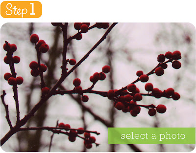
Step 1: The first step is to select a photo that you find visually interesting. It's good to remember that not all great photos make great illustrations and some truly mediocre photos make perfect illustrations – the more you use photos to draw, the better feeling you'll get for it. In general you want to look for a photo that is simple with high contrast. I also try to choose one that presents an iconic view of the subject; a photo that is straight-on or more shallow in it's depth will be easier to convert and the final result will be easily recognizable. In letterpress, each unique color is a separate run through the press so I try to use as few colors as possible.

My love of photography is what segued into design & now letterpress, so I have a stockpile of photos. This particular photo is of deciduous holly growing in central Minnesota. It wasn't taken with such a great lens, so you'll see some chromatic aberrations. The great thing about converting to an illustration is that those kind of flaws disappear. If you can't find any photos in your own library there are public domain photos & illustrations you can find on the internet and some really great ones you can buy at sites like iStockPhoto.


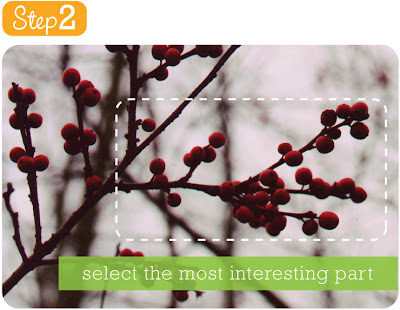
Step 2:
This step is pretty straight forward and incorporates the same tips from Step 1. You don't necessarily want to use the entire picture, so choose the best part. Crop your photo according to your taste and save a copy in an easy to find place on your computer.


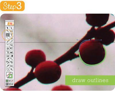
Step 3 (click for more detail): In this step it's time to bring your photo into your illustration program, in my case Adobe Illustrator. Create a new layer for your tracing or lock the photo onto the art board; you don't want it moving around during the process. Make sure to keep saving throughout the process, I've had more than one illustration eaten by my computer.

For the tracing process I always choose a bright colored line with no fill. This way I can see what I've done and not miss any of the remaining details. Mentally break up your image into smaller manageable parts. In this case, I'll do each berry separately, the brown end of each berry separately, and the branch in several pieces.


Since I am using my computer's mouse as my drawing tool, the Illustrator pen tool (circled above) makes the most sense. The automatic Bezier curves (see in action above) also help keep things looking natural and not ragged. To utilize the Bezier curves, click your first point and then click a second. On the second point do not release your finger while moving your mouse a little away from the point. You'll see the curve appear. Move your mouse around to get it just right. The next point you make will take lead from this curve, hopefully helping to create a natural line. If you
don't want the next point to follow it's lead click once on the point before proceeding (you'll see the control handle & tangent/directional line disappear on the active side). Keep making points until you are able to close the object (meaning last point & first point meet) – this is very important if you want to fill your object with color later on.

This type of illustration took me a while to get used to, so don't be disheartened by your first attempts. Try as much as possible to use the Bezier curves to your advantage – they can really help your drawing look natural. Single points strung together without any curves can end up looking jagged; this was my issue when I started drawing this way.


Depending on your level of expertise, here are a few good tutorials to get going in vector illustration, with more details & tips than I've provided here:


Mike's Sketchpad: The Anatomy of a Vector Illustration
This tutorial is perfect for beginners & intermediate illustrators using different programs. Mike takes the time to introduce all the tools & definitions for you in a very digestible way.


Lemontea: Definitive Vector Guide

Beginner/intermediate with a focus on Photoshop.

Adobe Illustrator Techniques: Imitating a Scanner Darkly
Advanced Adobe Illustrator tutorial for converting a photo into a piece of art, in the style of the movies A Scanner Darkly and Waking Life.

Melissa Clifton: Turn Photos of People into Line Art
Melissa has a lot of great tutorials, but I'm especially impressed with this advanced Photoshop tutorial. I frequented her site when I was just getting started. Even though her focus is on Photoshop, many of the ideas can be transfered to Illustrator.

Please feel free to add other pertinent links to the comments section.


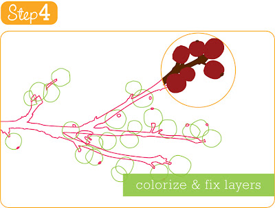
Step 4: This last step is a lot of fun because you get to see everything come together. Click on any finished shape (or multiple shapes that need to be the same color) and choose a new color for line & fill. You can even use the eyedropper tool to pick up a color from your original photograph.

Making sure everything is layered correctly can be tricky. This is why illustrators dealing with complicated images will use multiple layers in the beginning to separate out bottom, mid & top layers & even different colors. If you did everything in one layer, just select objects and move them as needed. For example, I would
select one of the brown seed ends and go to Object menu>Arrange>Bring to Front so it's on the very top where it can be seen. Check out the short cuts in the Arrange menu and it'll make it a lot faster.


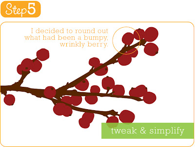
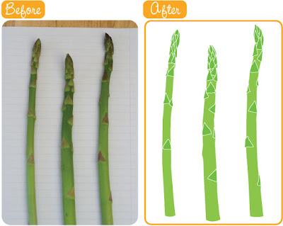
Step 5: This step may not be necessary. I like to simplify certain aspects (like the bumpy, out-of-place berry) or in my recent asparagus illustration I actually stretched the asparagus to be wider. Follow your artistic instincts.


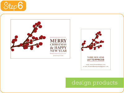
Step 6:
Now your image is ready to be used for design projects you may have. Above is one of the roughs for the Christmas card (slightly scaled) that my husband & I used last year. The other is a business card, just as an example. Notice that I decided to rotate the branch for these uses.

Getting this image ready for use in letterpress is another step that I'll go through in a another
post very soon. Do let me know if you have any questions! :-)

* * * * * * * * * * * * * * * * * *

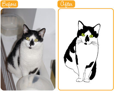
As a last note, here are a couple of other transformations from photo to illustration that I've done. The first is of my cat, Ushi. The second is of asparagus I expressly bought from the store for this purpose. I put the asparagus on a sheet of lined paper and quickly snapped the picture without much concern for lighting, but I'm quite happy with the final product. Enjoy, and happy drawing! :-)


Tuesday, February 12, 2008

New teapot letterpress card in Three Red Hens Etsy store!


In the coming weeks you'll see lots of new designs in the Three Red Hens shop. I have a whole lineup of plates waiting to be printed with and a box of Crane's Lettra paper & envelopes that came in the mail today. I'll be printing at least two designs a week!

This design was inspired by all the tea-drinking I do. I have a couple of other tea designs up my sleeve, so let me know what you think!

Saturday, February 9, 2008


To celebrate the second printing of my Hazel cards, I've compiled some of my favorite pieces from Etsy that feature man's best friend. Click on any of the pictures for a closer view and see below for direct links to the items in their respective shops.


Wednesday, February 6, 2008

Surprise visit from Saturn Press

The non-profit I work for also has a "museum" shop attached that sells some wonderful letterpress cards (none of mine yet). One of my favorite printers from our selection turned up today to take a look around.

Saturn Press is made up of two parts: Jane Goodrich who does the illustrations, many based off old public domain images, and James van Pernis who does all the printing. It's amazing that the two of them (and one person to help process orders) are able to print a million cards in a year. It's inspiring to someone just starting out.

Saturn Press makes its home in Swan's Island, Maine, a peaceful, beautiful & sometimes painfully remote-sounding place. They don't have a website so instead I'll leave you with a link to Cronin & Company, an online greeting card company who carries many of their designs. I've posted a few of my favorites here to show off.


My absolute favorite is the carrot-carrying rabbit. Jane said she based the wonderful print off of a Victorian era illustration. She reworked the rabbit, by changing the wilted flower he was originally
carrying into a carrot. As a note, she does all her illustration the old-fashioned way, with pencil & paper – not a computer in sight! Well done!

A couple days of printing

So this Monday & Tuesday I got a lot of work done. I printed all the envelopes & Love Nest cards for the special order, I printed a second edition of Hazel cards to sell on Etsy, I made up plates for my newest designs, and I even had a chance to print these cute little onesies & toddler shirt using wood type.

Ojiah is the newest son of a couple from work. Their older son (almost 3) is Sedge. I made a onesie for Ojiah professing his love for his older brother and a matching/reciprocating tee for Sedge.

Santino is the name my friend upstate has chosen for her first child. I wanted to make her something special to celebrate. I may end up making a lot more of these onesies and shirts – it seems that everyone's having a baby!


Sunday, February 3, 2008


I know I am not the first one in the world to discover these cute little kitchen gadgets, but I just thought they were worth sharing. Today at Target, amongst a wall of stainless steel corkscrews, spatulas & oven mitts were these super cute animal-themed kitchen tools.

Click for more detail...


Title banner) Octopus soap & scrubber
1) (My favorite!) Bird veggie/potato peeler
2) Toucan can opener
3) Starfish jar opener
4) Swordfish bread knife
5) Punk-u-pine scrubber
6) Shark bottle opener

The packaging for each product was great too, but I haven't been able to track down any pictures. :-(

See the whole collection online or shop for your favorites at Target.com.

Final designs chosen by Must Keep Knitting

I realized after trying to get everyone to weigh in on the different banner options I created for Must Keep Knitting, I never showed what her final choices were.

Etsy Banner
This is the banner she chose: dark brown knit pattern with light (almost teal) blue and pink (both by request). I think the colors work well together, although I wasn't sure at first.


Blog Banner
A slightly larger banner of the same style for her corresponding blog, Must Keep Knitting: The Blog.


Etsy Avatar

This is the final avatar that came about after some tweaking. For some reason Etsy cuts these square icons down unevenly so the outlined versions only worked at full size (in forums & other posting situations) and really nowhere else. So I just took away the border...

Header
A cute little header, with the same feeling, for patterns she will sell via Etsy. This will top off a printed piece of paper.


So all in all, making all these designs was lots of fun, however extremely time-consuming. There are a lot of very talented banner makers on Etsy who have banner-making down to an art, I'm sure. Maybe I will offer a custom designed package with options (like business card template, stickers, letterhead, etc.) or just the banner & avatar as a small thing once in a while. I'm less interested in the money and more interested in keeping my mind & skills sharp. I need to learn more about trading on Etsy, because that could be a fun option too.

In the meantime, check out Must Keep Knitting's shop on Etsy!