For me, the first step to a new letterpress card is the illustration. I keep an "idea notebook" of sketches, and most of my illustration is done by scanning sketches & tweaking on the computer, or by using my photographs as the basis for a new design. Over the course of several posts, I'll be showing you all the steps from idea to final product for the latter.
Along the way I'll include some links to similar tutorials & tips that I've found very helpful as I've learned how to use the computer to draw. Some of the tutorials use Adobe Photoshop and others use Adobe Illustrator. I am more familiar with using Illustrator, so that will be my reference here.
 Step 1: The first step is to select a photo that you find visually interesting. It's good to remember that not all great photos make great illustrations and some truly mediocre photos make perfect illustrations – the more you use photos to draw, the better feeling you'll get for it. In general you want to look for a photo that is simple with high contrast. I also try to choose one that presents an iconic view of the subject; a photo that is straight-on or more shallow in it's depth will be easier to convert and the final result will be easily recognizable. In letterpress, each unique color is a separate run through the press so I try to use as few colors as possible.
My love of photography is what segued into design & now letterpress, so I have a stockpile of photos. This particular photo is of deciduous holly growing in central Minnesota. It wasn't taken with such a great lens, so you'll see some chromatic aberrations. The great thing about converting to an illustration is that those kind of flaws disappear. If you can't find any photos in your own library there are public domain photos & illustrations you can find on the internet and some really great ones you can buy at sites like iStockPhoto.
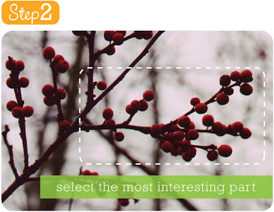
Step 2: This step is pretty straight forward and incorporates the same tips from Step 1. You don't necessarily want to use the entire picture, so choose the best part. Crop your photo according to your taste and save a copy in an easy to find place on your computer.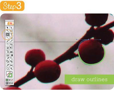 Step 3 (click for more detail): In this step it's time to bring your photo into your illustration program, in my case Adobe Illustrator. Create a new layer for your tracing or lock the photo onto the art board; you don't want it moving around during the process. Make sure to keep saving throughout the process, I've had more than one illustration eaten by my computer.
For the tracing process I always choose a bright colored line with no fill. This way I can see what I've done and not miss any of the remaining details. Mentally break up your image into smaller manageable parts. In this case, I'll do each berry separately, the brown end of each berry separately, and the branch in several pieces.
Since I am using my computer's mouse as my drawing tool, the Illustrator pen tool (circled above) makes the most sense. The automatic Bezier curves (see in action above) also help keep things looking natural and not ragged. To utilize the Bezier curves, click your first point and then click a second. On the second point do not release your finger while moving your mouse a little away from the point. You'll see the curve appear. Move your mouse around to get it just right. The next point you make will take lead from this curve, hopefully helping to create a natural line. If you don't want the next point to follow it's lead click once on the point before proceeding (you'll see the control handle & tangent/directional line disappear on the active side). Keep making points until you are able to close the object (meaning last point & first point meet) – this is very important if you want to fill your object with color later on.
This type of illustration took me a while to get used to, so don't be disheartened by your first attempts. Try as much as possible to use the Bezier curves to your advantage – they can really help your drawing look natural. Single points strung together without any curves can end up looking jagged; this was my issue when I started drawing this way.
Depending on your level of expertise, here are a few good tutorials to get going in vector illustration, with more details & tips than I've provided here:
Mike's Sketchpad: The Anatomy of a Vector Illustration
This tutorial is perfect for beginners & intermediate illustrators using different programs. Mike takes the time to introduce all the tools & definitions for you in a very digestible way.
Lemontea: Definitive Vector Guide
Beginner/intermediate with a focus on Photoshop.
Adobe Illustrator Techniques: Imitating a Scanner Darkly
Advanced Adobe Illustrator tutorial for converting a photo into a piece of art, in the style of the movies A Scanner Darkly and Waking Life.
Melissa Clifton: Turn Photos of People into Line Art
Melissa has a lot of great tutorials, but I'm especially impressed with this advanced Photoshop tutorial. I frequented her site when I was just getting started. Even though her focus is on Photoshop, many of the ideas can be transfered to Illustrator.
Please feel free to add other pertinent links to the comments section.
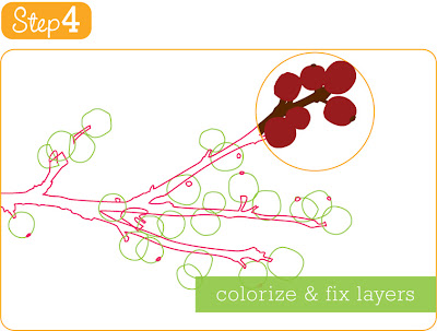 Step 4: This last step is a lot of fun because you get to see everything come together. Click on any finished shape (or multiple shapes that need to be the same color) and choose a new color for line & fill. You can even use the eyedropper tool to pick up a color from your original photograph.
Making sure everything is layered correctly can be tricky. This is why illustrators dealing with complicated images will use multiple layers in the beginning to separate out bottom, mid & top layers & even different colors. If you did everything in one layer, just select objects and move them as needed. For example, I would select one of the brown seed ends and go to Object menu>Arrange>Bring to Front so it's on the very top where it can be seen. Check out the short cuts in the Arrange menu and it'll make it a lot faster.
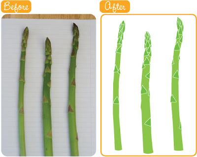
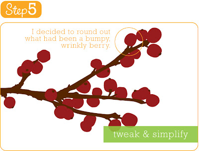 Step 5: This step may not be necessary. I like to simplify certain aspects (like the bumpy, out-of-place berry) or in my recent asparagus illustration I actually stretched the asparagus to be wider. Follow your artistic instincts.
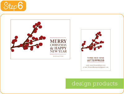
Step 6: Now your image is ready to be used for design projects you may have. Above is one of the roughs for the Christmas card (slightly scaled) that my husband & I used last year. The other is a business card, just as an example. Notice that I decided to rotate the branch for these uses.
Getting this image ready for use in letterpress is another step that I'll go through in a another post very soon. Do let me know if you have any questions! :-)
* * * * * * * * * * * * * * * * * *
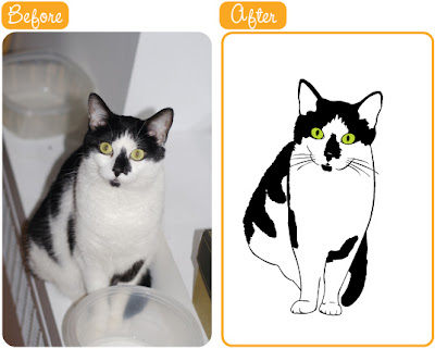
As a last note, here are a couple of other transformations from photo to illustration that I've done. The first is of my cat, Ushi. The second is of asparagus I expressly bought from the store for this purpose. I put the asparagus on a sheet of lined paper and quickly snapped the picture without much concern for lighting, but I'm quite happy with the final product. Enjoy, and happy drawing! :-)
.jpg)
.jpg)


_plates.jpg)

_plates.jpg)
_plates.jpg)
_plates.jpg)
_plates.jpg)


.jpg)
.jpg)